


Guide · 7 min read
Logo Aprons and Logo Embroidery on Staff Uniforms: Placement, File Preparation and Brand Consistency
A logo apron is one of the pieces that shows a restaurant’s or hotel’s identity to guests at the closest range. In this guide we explain where and how logo and name embroidery should be applied, and the preparation it takes, drawing on our experience as a uniform manufacturer in Turkey.
Why a logo apron is part of your brand identity
When your service team approaches the table, the apron is one of the first things guests see at eye level. With a well-placed logo, a logo apron reminds guests of your brand quietly but constantly. In cafés, restaurants, bars and hotel F&B outlets, the apron is both a functional layer that protects clothing and one of the most visible carriers of corporate identity.
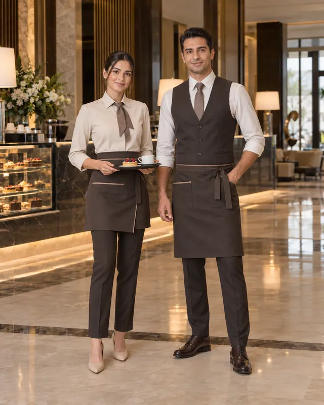
Still, rather than thinking of the apron in isolation, it should be treated as part of the team’s overall look. When the apron color, its harmony with the service shirt and vest, the logo size and the thread shade are considered together, a consistent and professional look emerges. In our F&B Service Collection, aprons, vests and service shirts sit side by side, making it easier to build a cohesive service look.
Where should the logo go on an apron?
Logo placement depends on the apron type. On bib aprons, the most common choice is the center or upper left of the chest; because this area sits at the level where eye contact with guests happens, the logo is naturally visible. On waist aprons, the logo is usually placed in a corner or just above the pocket.
When choosing the placement, think about use as well as visibility. Embroidery stitched directly over a frequently used pocket can wrinkle over time, and a logo that lands on the apron ties or a fold line may not look neat. Apron length and pocket layout matter too; on a short waist apron, the space available for a logo is far more limited than on a long bistro apron. When planning embroidered aprons, the following principles are a good starting point:
- Place the logo in an area that stays flat and doesn’t fold when the apron is worn.
- Keep the logo size in proportion to the apron; an oversized logo makes the look heavy.
- Keep logo placement and size the same on every apron across the business.
- Avoid embroidering over pockets, seams and tie points.
Logo placement on jackets, tunics and shirts
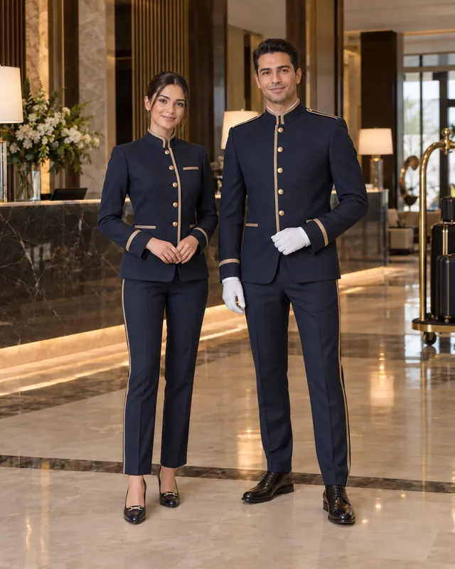
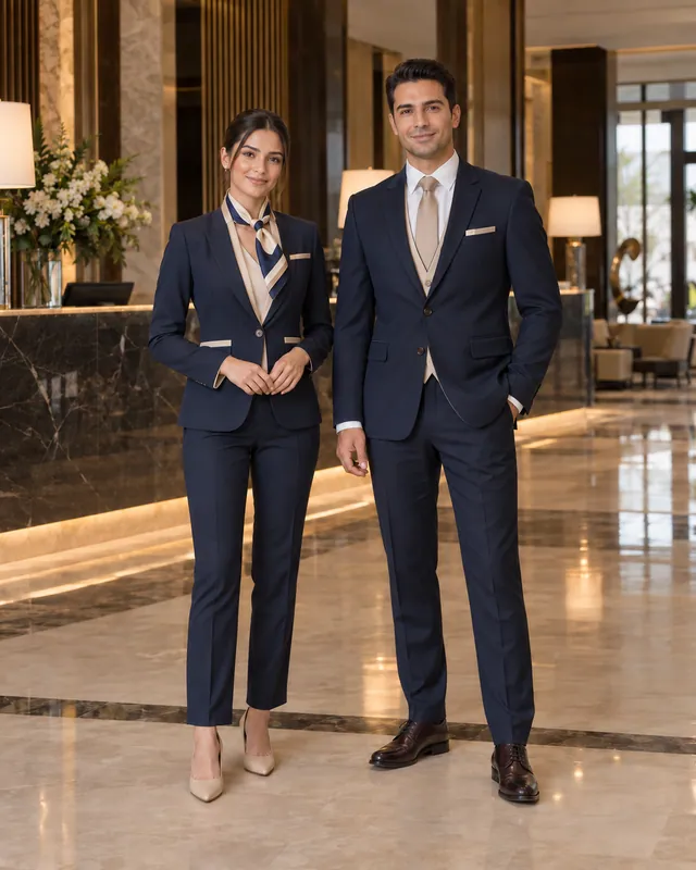
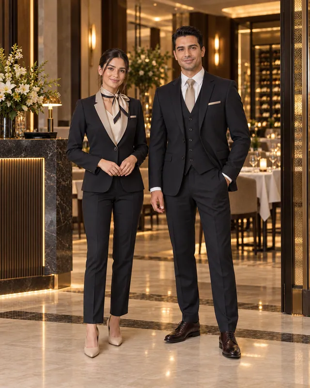
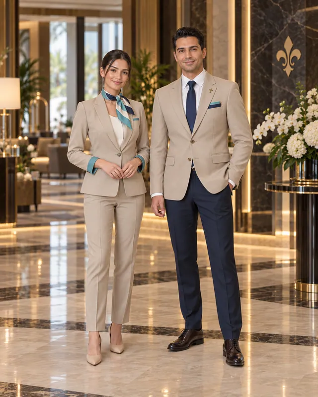
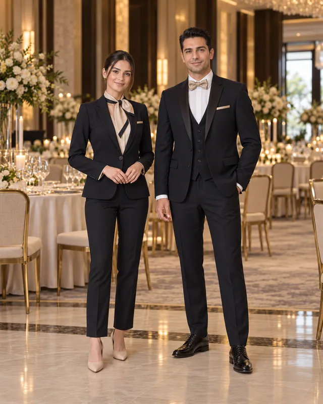
When planning branded staff uniforms, similar logic applies to pieces beyond the apron. On blazers and suit jackets, the logo is usually embroidered on the left chest, in line with the upper pocket; this placement fits classic tailoring conventions and doesn’t disrupt the jacket’s line. On mandarin-collar jackets and tunics, the left chest is also the first choice, while in some designs the collar tip or upper sleeve offers a more elegant alternative.
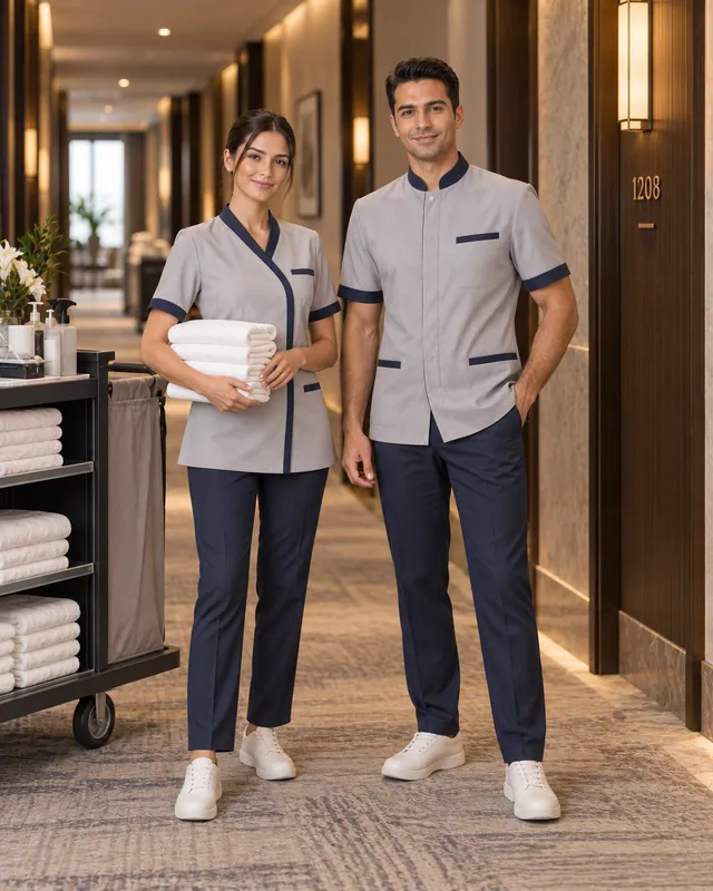
For kitchen teams, the left chest of the chef jacket is the most common logo area; name embroidery can go directly below the logo or on the opposite side. On housekeeping tunics, a simple, small-scale logo signals belonging to the brand while preserving a functional look. Whatever the garment, the goal is for the logo to look as though it was designed together with the piece, not like a label added afterwards.
Embroidery or printing? A general comparison
The two most common methods for applying a logo to staff uniforms are embroidery and printing. Embroidery stitches the logo directly into the fabric with thread, giving a textured, slightly raised and prestigious look. Its durability through frequent washing and heavy use makes it a popular choice for hotel and restaurant uniforms. On the other hand, with logos containing very fine lines, small lettering and color gradients, embroidery’s ability to render detail can be limited.
Printed aprons and printed garments can deliver more detail on large-surface, multicolor or photographic designs. However, a print’s durability depends on the technique, the fabric and laundry conditions; with heavy, high-temperature washing, fading or cracking can appear over time. As a general approach, embroidery stands out as the more classic and lasting option for pieces that will be used for a long time and carry the corporate image.
Rapsodi Collezione carries corporate identity onto uniforms through logo embroidery and name embroidery. Considering embroidery placement, size and thread color together with the fabric color and style is the most reliable way to achieve a result that is both elegant and long-lasting.
Preparing your logo file for embroidery
Embroidery quality depends heavily on how the logo is prepared digitally. The logo is converted into an embroidery program that the embroidery machine can read; for that conversion to be clean, the source file needs to be in the right format. A low-resolution screenshot or an image downloaded from social media can distort lines and lose fine details.
The number of colors matters as well: in embroidery, each color means a separate thread change, and logos stitched at a very small scale may need their fine details simplified. Light thread on a dark apron and dark thread on a light tunic improve legibility. If your logo has a single-color version, sharing it too makes it easier to get a consistent result across different fabric colors.
To keep quoting and production preparation moving quickly, we recommend having the following ready:
- Vector file of the logo (AI, EPS, PDF or SVG format)
- Corporate color codes (Pantone, CMYK or HEX)
- Alternative versions of the logo for dark and light backgrounds
- Brand guidelines and logo usage rules, if available
Name embroidery or name badges?
Being able to address staff by name creates a personal, warm experience for guests, especially in hospitality. There are two main ways to do this: name embroidery stitched directly onto the garment, or removable name badges. Both methods have strengths and weaknesses.
Name embroidery is permanent, carries no risk of falling off or getting lost, and offers a neat look that is integrated with the garment. On the other hand, the garment becomes personal to that employee and is harder to reuse when staff change. Name badges offer flexibility: the garment can be passed to another employee and the name changed easily. In tourism regions like Antalya, where seasonal employment is common, this flexibility is a significant advantage. However, day-to-day issues can arise, such as badges getting lost, being pinned on crooked or being forgotten before washing.
Many businesses strike the balance like this: name embroidery for positions with relatively low staff turnover, such as management, front office and guest relations; name badges for areas with large seasonal teams. If you opt for name embroidery, prepare the name list matched with size information and always check the spelling. Correct rendering of Turkish characters (ç, ğ, ı, İ, ö, ş, ü) is an important part of that check.
Brand consistency across departments
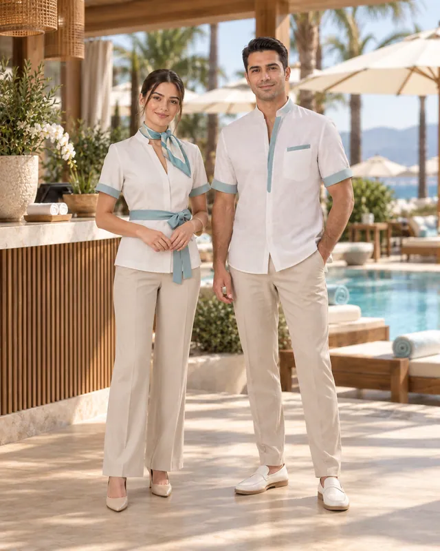
In a hotel, the uniforms of the reception, service, housekeeping and kitchen teams differ from one another, yet in the guest’s eyes they all represent the same brand. If logo size, placement and thread color vary randomly from department to department, that cohesion weakens. That’s why it pays to set a simple logo application standard that applies to all departments: where, at what size and in which color the logo is stitched on each garment can be gathered in a single table.
This standard also makes repeat orders easier. When you order for a new season or new staff, working from the same embroidery file and the same placement ensures old and new pieces look consistent side by side. A practical method is to keep an approved embroidery sample for each item as a reference; when a new order comes in, that sample serves as a quick checkpoint to verify logo placement, size and thread color. This way, no noticeable differences appear between pieces produced at different times. If you’re planning a complete uniform program with details unique to your brand, take a look at our custom design process, and add your chosen items to your quote list along with your logo and name embroidery preferences.
Frequently asked questions
What format should I send my logo in when ordering logo aprons?
For the best result, we recommend sharing your logo’s vector file (AI, EPS, PDF or SVG) together with your corporate color codes. If you don’t have a vector file, you can send the highest-resolution image you have; in that case the logo may need to be adapted for embroidery.
Can the same item have both a logo and name embroidery?
Yes, logo embroidery and name embroidery can be planned together on the same item. In that case, positioning the two so they balance each other, for example the logo at the center of the chest and the name to one side, gives a tidy look.
Which is more durable, embroidery or printing?
In general, embroidery gives a more lasting result under frequent washing and heavy use. The durability of a print varies with the technique, the fabric and laundry conditions. Embroidery is usually preferred for pieces that will carry the corporate image for a long time.
Should the same logo size be used across different departments?
The logo’s proportions and colors should stay the same across all departments; the size, however, may vary slightly by garment type. For example, a chest logo on a jacket and a logo on a waist apron can differ in size, but each should be kept consistent within its own product group.